Pick a Label Finish That Supports Your Brand
The finish on your label can change how your whole product feels in someone's hand. Gloss and matte laminate finishes both give custom product labels and stickers a polished look, but they create very different effects with color, light, texture, and text.
As a veteran-owned, family-owned Detroit print shop, we design and print everything in-house. We help you look at the finish alongside your artwork, packaging, and product goals. Every order receives a proof before printing, so you have time to review the selected finish and the small design details that matter.
How Gloss and Matte Label Finishes Differ
Gloss labels have a shiny, reflective surface. That shine can make colors look brighter and graphics feel more energetic. If your design uses bold color blocks, playful illustrations, strong contrast, or bright product photos, gloss may support that eye-catching direction.
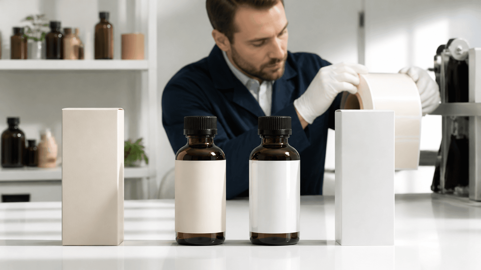
Matte labels have a softer, low-reflection appearance with a smooth feel. This finish often works well when you want a calm, clean, or refined presentation. It can pair nicely with simple type, muted colors, natural-style artwork, and packaging that has a premium look without a lot of shine.
Neither option is automatically better. The right choice depends on how you want your brand to come across when a customer sees the product on a shelf, opens an online order, or holds the package in person.
Before we print, we recommend comparing a few parts of your design:
- Your logo and brand colors
- The amount of text on the label
- Your package material and surface
- Whether product photos are part of your marketing
- The overall mood you want customers to notice
The proof stage gives you a chance to confirm that the artwork, label shape, and chosen finish all work together before production begins.
Match the Finish to Your Product and Artwork
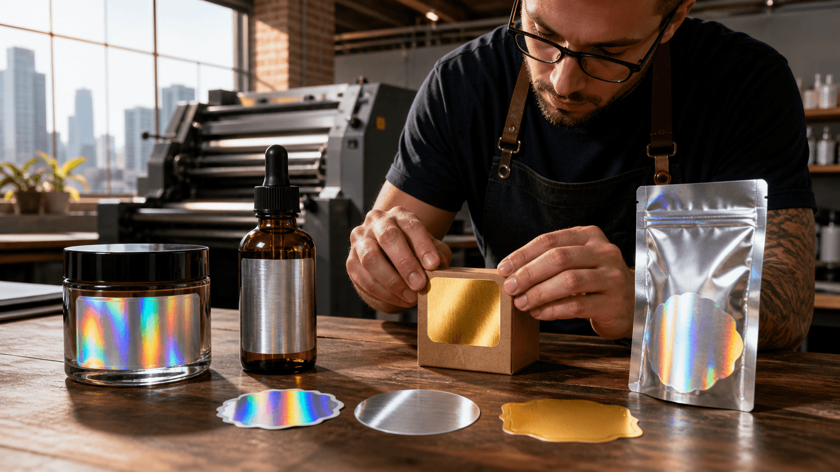
Gloss vs. matte labels often comes down to the design style you already have. Gloss can be a natural match for colorful artwork, high-contrast graphics, bright photography, and metallic-looking details. It can give a label a lively look that stands out against simple packaging.
Matte may be a stronger fit for clean layouts, text-focused designs, earthy color palettes, and understated branding. A matte finish can help fine typography and minimal designs feel intentional rather than plain. It is especially worth considering when the label itself is meant to feel calm, modern, or upscale.
Product photos deserve some thought, too. Gloss labels can catch light in photos, which may create visible reflections depending on the setup. Matte labels generally have a less reflective appearance, which can be helpful for product listings, social posts, and other marketing images. If online sales are part of your plan, we suggest thinking about how the label may look from several angles, not just straight on.
Your label should also fit the full package, not sit apart from it. A glossy label on a shiny jar can create a different effect than the same label on a kraft box, clear bag, textured container, tumbler, or plain bottle. When we review your proof, we can help make sure the label presentation makes sense for the branded product it will live on.
Protect Readability From Shelf to Shipment
A beautiful label still needs to be easy to read. Small text, ingredient lists, instructions, product names, and QR codes all deserve enough room and contrast. Matte can be useful when reducing glare is a priority, while gloss can work well when strong color and sharp contrast are central to the design.
No finish can fix text that is too small or placed on a busy background. Black text over a dark photo, pale text over a low-contrast color, or crowded lines can be hard to read on either gloss or matte custom product labels. Giving important information breathing room makes a big difference.
Label placement matters as much as the artwork. A flat box gives customers a different viewing angle than a curved bottle or jar. Clear packaging, bags, and shiny containers can also affect how the design is seen under overhead lights.
Keep these practical details in mind:
- Leave space around important text and codes
- Use clear contrast between type and background
- Consider where the label faces when the product is displayed
- Think about reflections on curved or shiny packaging
- Review the proof at a realistic viewing size
A strong label is not only attractive from across the room. It should stay clear when someone picks up the package, turns it in their hands, and reads the details closely.
Prepare Custom Product Labels for a Clean Result
Good file setup helps us produce clean, consistent labels. We recommend building artwork at 300 DPI, adding bleed beyond the cut edge, and keeping text, logos, and other important elements inside a safe zone. These steps help protect your design when the label is trimmed to its final size.
Shape choices can also guide the look of the finished piece. Standard shapes work well for many product labels, especially when you need a clean and familiar format. Die-cut stickers can be made in any shape, making them a useful choice for logos, mascots, custom outlines, handouts, branded packaging, and events.
For products that need repeated application, roll labels can be a practical format. Individual die-cut stickers can make sense for online orders, packaging inserts, or promotional use. Saving your approved artwork and order details also makes future reorders more consistent, whether you stay with the same finish or update your design later.
Choose Your Finish and Start Your Order
We print custom labels in-house in Detroit and ship nationwide, with free local pickup available at our shop at 8942 W Fort St, Detroit. Production is typically 1 to 2 business days after proof approval. Eligible first orders can receive 250 gloss paper labels in standard shapes up to 3 by 2 inches for $100 with no setup fee. Logo design is available separately for a flat $35.
The best finish is the one that fits your artwork, package surface, readability needs, and photography plans. Choose gloss when you want shine and bold color impact, or choose matte when you want a softer, lower-glare look. Reviewing the proof carefully before printing helps you move forward with a label that feels right for your product.
Get Labels That Match Your Product
At IPS Detroit, we can help you move from proof to print with custom product labels made for your packaging and application needs. Everything is designed and printed in-house, and we provide a proof before production so you can check the details. Contact us to discuss your label project, material options, and order timeline.